Chat Application with Polymer - II
In my last post, we have built a very basic chat application based on the Socket.IO Chat Application Example. We have used some Polymer elements to demonstrate how to use the custom elements. In this post, I want to focus on the “Polymer Layout Attributes” and then create a new custom element using Polymer.
Polymer Layout Attributes
In addition to a set of custom elements, Polymer project provides a novel way to lay out the HTML elements. Polymer defines a set of layout attributes which you can attach to the HTML elements to specify their layout. The mechanism is based on the CSS Flexbox. For example the code below stacks the inner divs in a horizontal layout. We have added the flex attribute to the middle div “Beta” to stretch it all the remaining space remaining from the other two elements:
<div horizontal layout>
    <div>Alpha</div>
    <div flex>Beta (flex)</div>
    <div>Gamma</div>
</div>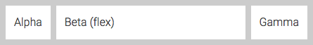
Apart from CSS Flexbox like attributes (vertical & horizontal alignment), there are two very useful attributes Polymer provides:
fullbleed: You can addfullbleedattribute to a<body>element to make sure it takes the entire viewport. Setting fullbleed removes the margins and maximizes its height to the viewport.unresolved: You can addunresolvedattribute to a<body>element to hide the custom elements until all elements are upgraded, i.e., defined to the browser with adocument.registerElement()function call. Theunresolvedtag is a simple workaround which can be used in simple applications, for more detailed control you can use the:unresolvedpseudo class.
As a demonstration for the Polymer Layout Attributes we can apply them to our Polymer Chat Application. First, let us attach fullbleed and unresolved attributes to the <body> element. We can also remove the fixed positioning of the message entry form by making the <body> a vertical flexbox. The final look for the <body> tag turns out as below:
<body onLoad="onLoad()" fullbleed unresolved vertical layout>We want the #messages node to span all the remaining screen from the text entry, to accomplish this we will add the flex attribute. For messages to flow top to bottom we set the message view with vertical flexbox attributes to make it a vertical flexbox layout. Finally we set the node containing text input and send button with the horizontal flexbox attributes so they place side by side horizontally. The final CSS & HTML becomes as below:
<html>
    <head>
        <!-- ... -->

        <style>
            paper-input {
                padding: 10px;
            }
            paper-shadow {
                margin: 5px;
                padding: 10px;
                float: left;
            }
        </style>

        <!-- ... -->

    </head>
    <body onLoad="onLoad()" fullbleed unresolved vertical layout>
        <div id="messages" flex vertical layout start></div>
        <div horizontal layout center>
            <paper-input id="text" label="Enter message to send" flex>
            </paper-input>
            <paper-icon-button id="button" icon="send">
            </paper-icon-button>
        </div>
    </body>
</html>As you can see above we have removed most of the CSS and instead set the layout of the application with Polymer layout attributes. It is a very practical way to lay out an HTML page with Polymer Layout Attributes, but when it comes to maintainability and extensibility I am not sure if it is the best way. CSS Flexbox might provide a better solution for reasonably bigger applications. Well, I guess both methods have their own uses for different projects.
Creating Custom Elements
So far we have used custom elements from the Polymer project. Polymer also provides its own method for building new Web Components. Yes, one can directly use the methods defined by the Web Consortium, i.e., document.registerElement(), <template> tag, and shadow property for shadow DOM. But since we are experimenting with Polymer, here I will describe how to create a custom element using Polymer.
In the <body> section of our chat application we have a #messages node to display the messages. Below it we have a container node for a message entry box and the send button:
<div horizontal layout center>
    <paper-input id="text" label="Enter message to send" flex>
    </paper-input>
    <paper-icon-button id="button" icon="send">
    </paper-icon-button>
</div>
In addition to the HTML nodes, we also have JavaScript code handling events for the #text and #button elements and CSS definition for the <paper-input> element. We can create a custom element to wrap all these information and behavior, i.e., a “message editor” custom element.
According to the specification, a custom element name must contain a '-' character, to separate them from the native elements and also, probably, prevent any conflict which may rise when adding new standard elements to the HTML. The Polymer custom elements use a prefix which defines the category a specific custom element is in, i.e., paper- and core-. We can use a similar approach and use the 'chat-' prefix when naming any elements we might create for our chat application.
So we can start implementing our <chat-message-editor> custom element. Let us create an elements directory to contain all our chat elements. Below you can see the elements/chat-message-editor.html:
<link rel="import" href="/bower_components/polymer/polymer.html">
<link rel="import" href="/bower_components/core-icon/core-icon.html">
<link rel="import" href="/bower_components/paper-input/paper-input.html">
<link rel="import" href="/bower_components/paper-icon-button/paper-icon-button.html">

<polymer-element name="chat-message-editor" constructor="ChatMessageEditor">

<template>
    <style>
        paper-input {
            padding: 10px;
        }
    </style>

    <div id="container" horizontal layout center>
        <paper-input
            id="input"
            label="Enter message to send"
            on-keypress="{{keyPressed}}"
            flex>
        </paper-input>
        <paper-icon-button
            id="button"
            icon="send"
            on-tap="{{buttonTapped}}">
        </paper-icon-button>
    </div>
</template>

<script>
    Polymer({
        sendMessage: function() {
            this.asyncFire("message",
                {
                    message: this.$.input.value
                });
            this.$.input.value = "";
        },
        keyPressed: function(event, detail, sender) {
            if (event.which == 13) {
                this.sendMessage();
                event.preventDefault();
            }
        },
        buttonTapped: function(event, detail, sender) {
            this.sendMessage();
            event.preventDefault();
        }
    });
</script>

</polymer-element>As you can see, we have moved the HTML Imports into the element’s own HTML file. The <polymer-element> is a declarative way to define a new Web Component. The name attribute specifies the name of the new custom element. By providing the constructor attribute we have let the Polymer to generate a constructor function for our new element. So that we can create a new <chat-message-editor> in code by simply invoking it, such as:
var editor = new ChatMessageEditor();In the <template> section we define the style and HTML of our new custom element. As you can see we have moved the most of the code from our previous index.html file into the <template> section of the <polymer-element>. The exception is the double mustache notation {{...}} used to define the on-keypress and on-tap events. Polymer provides a declarative event mapping functionality, which allows us to define handler functions to the elements in the <template> node. You can see their implementation in the next section of the <polymer-element>, the <script> section.
Finally, when defining our new custom element, we make a call to the Polymer() to register it, in the <script> section. We provide the element’s prototype as the parameter to the Polymer() call. In the prototype we define the on-keypress of <paper-input> element and the on-tap of <paper-icon-button> elements, the keyPressed() and buttonTapped() functions. The event handlers accept 3 arguments, event, detail, and sender. The Polymer documentation describes them as below:
eventis the standard event object.detailis a convenience form ofevent.detail.senderis a reference to the node that declared the handler.
The sendMessage() function is a function invoked by the other two functions, i.e., event handlers. The sendMessage() function uses the asyncFire() of Polymer to send custom events. The message event will be fired, when the user clicks the send button or presses RETURN key. We can catch it in our top level index.html and send it to our Socket.IO server.
Finally we can replace the <div> containing the #text and #button elements with a one line of code:
<chat-message-editor id="editor"></chat-message-editor>As the final touches we need to add the HTML import declaration of the <chat-message-editor> element in the top level index.html file:
<link rel="import" href="/elements/chat-message-editor.html">And add the app.use() call into the index.js file so that our server can serve the files in the elements directory, similar to the bower_components.
app.use("/elements", express.static(__dirname + "/elements"));You can find the full source at GitHub.